Developing The Character Designs
After sketching out all of the work from the previous page, I picked out the most important sketches to turn digital. Both sketches of Echo and Shizu were going to be made into digital pieces. I find it far easier and less time consuming to experiment with colours digitally. For this I used the same program as before for my last digital pieces, paint tool sai as this is a program i'm experienced with but still learning new techniques.
I had to think very carefully about what colours to use, I needed to make sure that their colours were unique to each other as much as possible but a palette that presented the right moods and personalities. For example, to keep Echo more mysterious I wanted to use blue colours, almost as if he was ghost like? But for Shizu I wanted her to blend in with the forests a little bit, and her colours needed to look girly but not too girly that she didn't look mean. The forests I'm going to be making will have pink trees in them so I was thinking about a scenario where she may have been hiding at one time or spying on passerby animals in the treetops.
I had to think very carefully about what colours to use, I needed to make sure that their colours were unique to each other as much as possible but a palette that presented the right moods and personalities. For example, to keep Echo more mysterious I wanted to use blue colours, almost as if he was ghost like? But for Shizu I wanted her to blend in with the forests a little bit, and her colours needed to look girly but not too girly that she didn't look mean. The forests I'm going to be making will have pink trees in them so I was thinking about a scenario where she may have been hiding at one time or spying on passerby animals in the treetops.

|

|
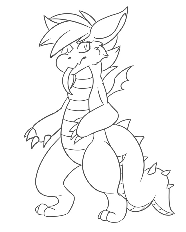
The first step of creating the digital concepts, was to line the artwork as neat as possible. Luckily paint tool sai has good brush stabilizers unlike photoshop, and this gives a far neater finish, and this is why I prefer to use it for flat artwork or basic line art.
I chose to use a grey colour for the line art because I thought that black would be too harsh when It came to the colouring process, it just makes it look softer in terms of presentation.
Here are the two line art pieces of Echo and Shizu. Though Shizu looks bigger, a reminder that Echo stands six feet tall and that Shizu stands about 5 foot tall, so they are not to scale with each other.

|
|
The next part is my favorite, the colouring of the line art. It is very easy, my method of doing this is too select the outside of the lines with the magic wand tool, invert the selection and then make a new layer underneath the line layer. And start colouring
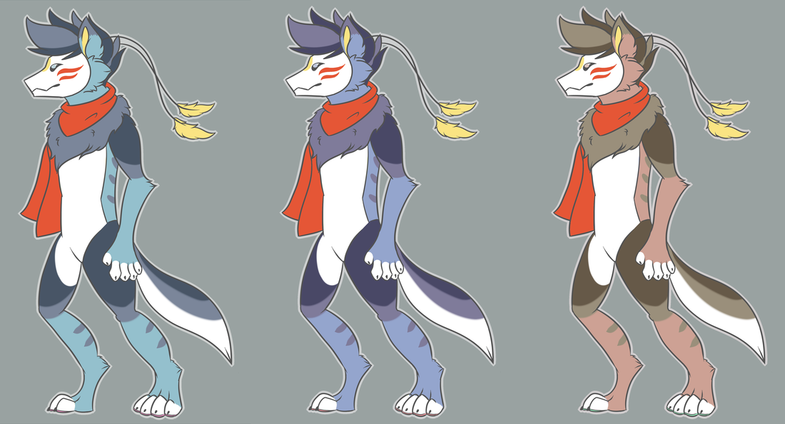
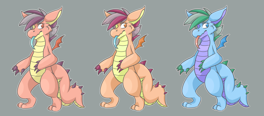
I made sure to create three different colour concepts, to do this I mainly played around with the hue and saturation and picked out the two alternatives that I liked the most. The originals are on the left, and the other two pieces of each character are edited concepts.
I made sure to create three different colour concepts, to do this I mainly played around with the hue and saturation and picked out the two alternatives that I liked the most. The originals are on the left, and the other two pieces of each character are edited concepts.
Echo (Hibiki) Main Character Colour Concepts
Concept 1 (Original) - For Echo's concepts, I wanted them to be flat coloured. I only wanted to experiment with the colours this time around. He looked awfully plain without markings so I made sure that I added the stripes and the patches on the arms and legs. I stuck with the blue colour palette for the original because as mentioned before, I wanted him to look mysterious and ghost like. I want people to think 'What does he look like under that mask?' and 'Why is he always treading through the forests at night?' I don't want him to scare people but I do want there to be a lot of curiosity about his character. I wanted to keep the scarf red because I felt like it drew more attention to the head of the character, I want as much of the players focus to go towards Echo's mask as much as possible.
Concept 2 - This second concept was created with only slight adjustments to the palette. I'm unsure if I prefer this palette over the first one. Both of these are really good concepts and it is hard to choose. I may need second opinions on them both. But so far everyone I have asked seems to lean more towards the first and third concepts, and I agree with them.
Concept 3 - This concept I actually like a lot, I'm not sure why. It is probably because of the more natural looking colours of the fur coat? Even though the colours are not perfect, I never really thought to add a brown palette. I wanted to avoid what you'd expect from reality and try keep the fantasy theme with the colours. You would expect to see a brown canine but not a blue one, though if I was to stick with this concept I would definitely adjust the brighter colours of his fur.
Shizu (Silent) Villain/Rival Character Colour Concepts
Concept 1 (Original) - For Shizu's concepts, I decided I wanted to experiment with shading this time. I'm still very new to the shading but I think I did an okay job with it. I stuck with the idea of having her pink. At first I wanted her hair to be red, but I thought that purple would work better with the pink, I used the red for the wings and eyes instead.
Concept 2 - Again another tough decision with this one, though I think I still prefer the original. Some parts of this concept I really like, such as the claws and the hair. I still prefer the pink from the original but I may end up combining the first and second concepts together. Though for now I'm probably just sticking with the first.
Concept 3 - My least favorite of the concepts, the blues and greens just don't look right to me. I think it is because it looks very opposite compared to the original and I don't like the combination with purple in it either. If I had to choose something I like about it, it would be the blue eyes and the blue wings.
Experimenting with Environment Concepts
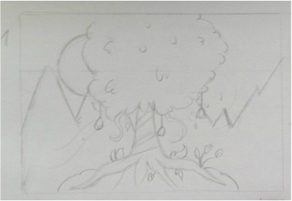
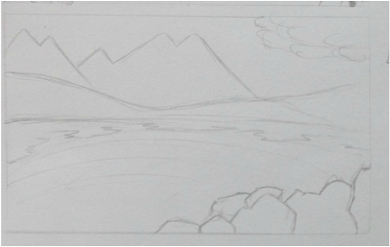
I chose the two sketches below to experiment with, the reason I chose these was because they were less complex than the other sketches and I thought they would be easier to experiment with.
|
|
Rather than choosing to paint both of these sketches, I decided after painting the first sketch that I didn't want to continue painting the other sketches, as I had already used marker pens in the concept art research and used some pens, I knew I needed to try pencil crayons. I wanted this particular tree in the painting to be glowing, almost as if it was like a tree of life that was in the middle of the forest. This is why I didn't try to add too much tones to it whilst I was painting.
I don't think my hand is steady enough for painting. I'm not pleased with the outcome, but in comparison to the painting, the pencil crayon drawing turned out really well and i'm very happy with it to say I had limited colour choices.
For the painting I used acrylic paint and watercolour paint, and a white gel pen. For the coloured pencil drawing I used staedtler pencils. I usually would use prisma coloured pencils but I thought it would be nicer to try a different brand to experiment with.

|

|
Experimenting With Weapon Concepts
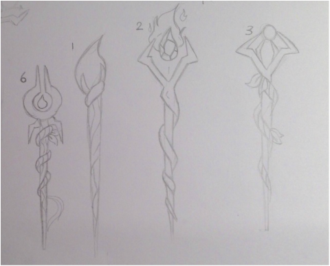
Next I wanted to experiment with two of the weapon concepts, I chose to combine a few of my concepts from the sketchbook section and continue experimenting with the coloured pencils. I also added a brief description for each weapon and what they were equipped with and how I would imagine them to be described during game play.
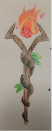
For the first concept the description read "A staff made from the finest woods and vines from the enchanted forests" with a note that said - Equipped with a fire crystal, stronger than the blue fire but has a shorter range.
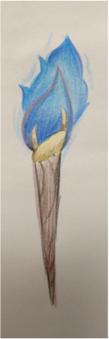
For the second experimental concept the description was "A torch hand crafted by the elders of the enchanted forests." with a second note that said - Equipped with a blue fire crystal, weaker than the original fire but does have a wider range.
For the first concept the description read "A staff made from the finest woods and vines from the enchanted forests" with a note that said - Equipped with a fire crystal, stronger than the blue fire but has a shorter range.
For the second experimental concept the description was "A torch hand crafted by the elders of the enchanted forests." with a second note that said - Equipped with a blue fire crystal, weaker than the original fire but does have a wider range.
|
|
A while ago, I also attempted to make the younger stage of Echo in a program called Sculptris. As much as I love digital work I find 3D digital artwork extremely difficult, it is way outside of my comfort zone. When I would try make the ears stand up like in his concepts, they would look too flat or too thin. Whenever I tried to bring the mask out to make the muzzle, I would ruin the rest of the mask by accident. It is a very frustrating program to use in my opinion. This was the best I could do with the modelling, I know I may need to practice more, even though it is only Echo's head I'm still happy that I at least attempted to make a concept from the program.

