Bridgette Barrager - Early Concept Artist For 'Gravity Falls'
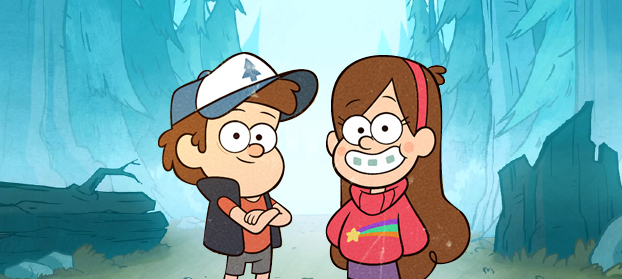
Lately, I have gotten into a Disney cartoon known as 'Gravity Falls', briefly it is about two twin siblings known as Dipper and Mabel who are sent to stay with their great-uncle Stan in a mysterious place known as Gravity Falls.
Considering that my game had a lot of concepts to be based in forest like environments, and that I have started to become a big fan of this show, I thought it would be a great opportunity to do a little further research into the concept art. After a little researching I finally found that the early concept artist was named Bridgette Barrager, I found that she had her own blog where she posted her concept wrok as well. From her blog I learnt that she had graduated from CalArts (a private university in California) in Character Animation back in 2007.
On her blog she wrote "About four years ago my friend Alex asked me if I'd do some rough character designs for him... It was going to be about a brother and sister who spend their summer in a weird town in Oregon with their creepy old uncle." this was apparently a basic description Bridgette was given before she went off and created her first few concept art drawings.
(Alex Hirsch is the creator and executive producer of the Gravity Falls series)
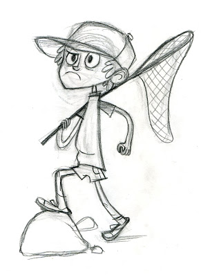
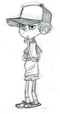
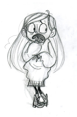
The next picture shows Bridgette's concept artwork that she later produced for the character 'Dipper'. She had wrote that the drawings were done before Alex had developed a story for the pilot episode of the show.
Another quote from Bridgette's blog saying - "He gave me a written run down of what the characters were like and I just doodled out a bunch of stuff." Bridgette decided to brainstorm her ideas by sketching out everything she could visualise in her head for Dipper, rather than jotting down quick notes on what she would personally add to the character concepts themselves.
As for the first picture, I really love how Bridgette began making a range of character variation as soon as she was given her description. I sometimes find that difficult unless I researched or had lots of inspiration beforehand. I also really like how she has played around with the different clothing styles and types of hats, it's also really clear which hat ideas Bridgette liked and stuck with throughout her concept sketches and how she developed those hat design's overtime.
On her blog she wrote "About four years ago my friend Alex asked me if I'd do some rough character designs for him... It was going to be about a brother and sister who spend their summer in a weird town in Oregon with their creepy old uncle." this was apparently a basic description Bridgette was given before she went off and created her first few concept art drawings.
(Alex Hirsch is the creator and executive producer of the Gravity Falls series)
The next picture shows Bridgette's concept artwork that she later produced for the character 'Dipper'. She had wrote that the drawings were done before Alex had developed a story for the pilot episode of the show.
Another quote from Bridgette's blog saying - "He gave me a written run down of what the characters were like and I just doodled out a bunch of stuff." Bridgette decided to brainstorm her ideas by sketching out everything she could visualise in her head for Dipper, rather than jotting down quick notes on what she would personally add to the character concepts themselves.
As for the first picture, I really love how Bridgette began making a range of character variation as soon as she was given her description. I sometimes find that difficult unless I researched or had lots of inspiration beforehand. I also really like how she has played around with the different clothing styles and types of hats, it's also really clear which hat ideas Bridgette liked and stuck with throughout her concept sketches and how she developed those hat design's overtime.

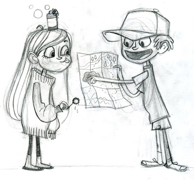
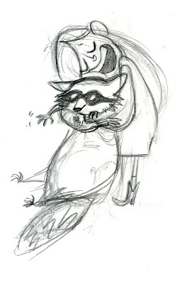
For the second lot of concept sketches Bridgette considered the following - "...Dipper is based on Alex as a kid and he should also have a hat...maybe a captain's hat, or one of those Greek fisherman's hats, or a kinda too big trucker hat?" she then marked the bottom left sketch with a small asterisk indicating it was her favourite out of the rest of the character concepts, I have to agree with her because I really like the way Dipper looks at this point, he doesn't look too abnormal and in my opinion works really well in terms of the small description she was given.

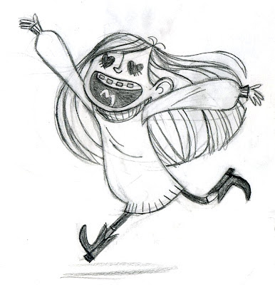
Bridgette then moved on to make concept drawings of Mabel, Dipper's twin sister. She also mentioned that the prompts she had whilst making concepts of Mabel were, 'wears hideous sweaters', 'Is Dippers foil', and that she is supposed to be the 'fun one'.
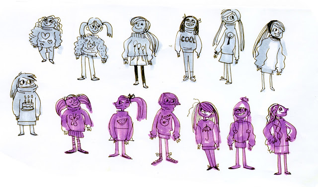
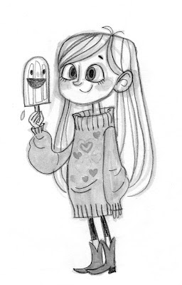
You can see how well Bridgette stuck with her prompts, she has created a variety of sweater designs, used positive facial expressions to match the 'fun' side of Mabel's personality and tried to combine all of that with different hairstyles. Later on, she had developed a few more concept drawings of Mabel, this time focusing on a longer hair style. She also marked another two sketches with an asterisk to remind herself which was her favourite or those that she wanted to develop later on.
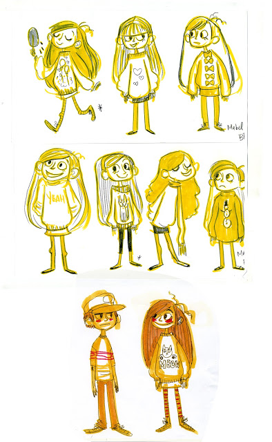
Even though the first concept sketches were created by Bridgette, they agreed that the show should look more her friend Alex's art style since it was their original idea. This may be the case, but plenty of the details from Bridgette's work has actually been passed on and used in the show today, for example Mabels style of sweater and her headband, Dippers style of hat and shorts have been used in the show. She also mentioned that she created a few more sketches before this final decision was made, these concept drawings present both Dipper and Mabel's personality extremely well. All of this can be seen in these last few concept drawings she made.
Sean Jimenez
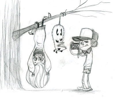
As well as Bridgette herself working on Gravity Falls, her husband Sean Jimenez worked on the show as a background supervisor. He created his very own rough drawings, thumbnails and line work or inked concepts for the show. I think that they are fantastic pieces of artwork to look at and they capture the show's style very well, I also love how tidy the environments and scenes look in his work.
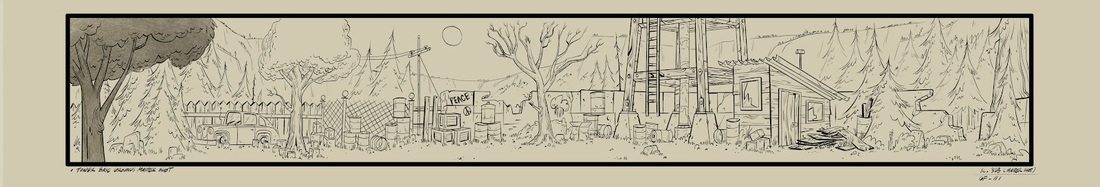
Rough Background
Inked Background
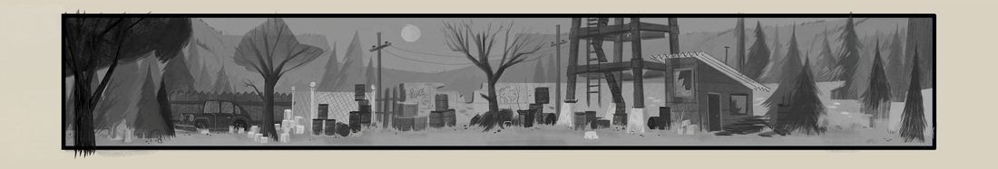
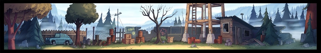
Painted Background - By Ian Worrel
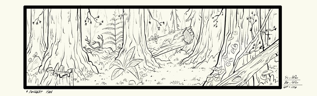
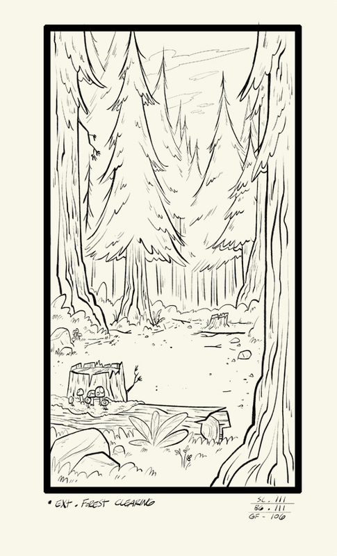
More inked backgrounds by Sean
After looking through Sean's blog, I decided that I would just pick out my favorite inked artwork. Unfortunately there isn't much information on his work like there was for Bridgette's, as he doesn't say much about them and why he drew these the way he did. Though he has posted a lot more work.

Thankfully Sean did explain in his blog why he drew the thumbnails so small, he wrote - "Due to the bullet train speed of the production schedule I mainly have to work really small just to define the basic composition and primary shapes as fast as possible..." He also mentioned on his blog that uses photoshop for his work (especially the small thumbnails like the ones below.) It is something that I would like to try out myself as I have not worked so small before.

|

|

Emulating Concept Techniques
After looking through Bridgette's work, i'm guessing she may have used some markers similar to Copics. I own a few of these myself so it would be fun to try emulate her techniques. Luckily I have the perfect colours to use, almost the same as what Bridgette did! I think that the markers make the concept drawings stand out a lot more, I really like the idea and I cannot wait to get started.
Here is what I will be using for the concept drawings. Though I will only be choosing one or two of the colours and not using all of them.
Here is what I will be using for the concept drawings. Though I will only be choosing one or two of the colours and not using all of them.

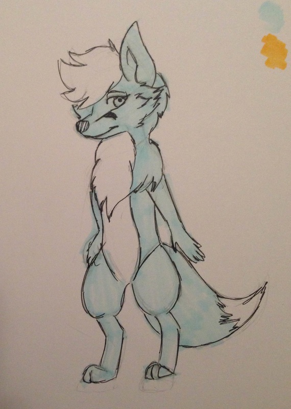
The first thing I wanted to do whilst trying this technique was to create concepts for a new character, that way I thought it would be more accurate to the way Bridgette created her own concepts. I wanted to create a new female character possibly a friend of the main character? I wanted her to be a fox, I was unsure if I wanted this character to be a anthropomorphic character or feral character. But since I have plans for my other characters to be anthropomorphic I thought it was probably a better idea to also make this character fit in with the rest. For the first concept I outlined with a line art pen after the marker was applied. This one is my least favorite, the anatomy looked a little lazy and I hated that pink marker. It made the drawing look really scruffy.
The second concept sketch is in my opinion, the best one. The anatomy looked a lot neater, I like the way she looks overall. I used a pencil to outline this time, it looked less scruffier and a lot softer than the first concept. Though I felt like something was missing, I regret not adding any hair to this concept so I added it to the third one. This third concept is a very rough anthropomorphic version of what I would imagine this female fox character to look like, short body small hands and small paws.
Overall, this technique was much harder than it actually looked. Possibly because I used the wrong paper and it was bleeding through, but nothing really turned out the way I imagined them too. Even though I'm happy with one or two of the outcomes, I think that in the future I should try different markers or paper. I'm also unsure about whether or not to keep this character for my game, but I would still like to focus more on the designs of my other characters.

|

|
|
